Project 04
Textile print patterns for Tommy Hilfiger
A 10-day Craft Cluster Initiative Program which aims to provide the students with continuous exposure to the handloom and handicraft clusters, thus providing an opportunity for creative innovation and experimentation. This research was aimed to reach out to the artisans and craftsmen at the grass root level and to witness the realities of the craft sector and get insight into regional sensibilities,diversities, resources and environment.
Please check out the work in the following link :

Project 04
Textile print patterns for Tommy Hilfiger
A 10-day Craft Cluster Initiative Program which aims to provide the students with continuous exposure to the handloom and handicraft clusters, thus providing an opportunity for creative innovation and experimentation. This research was aimed to reach out to the artisans and craftsmen at the grass root level and to witness the realities of the craft sector and get insight into regional sensibilities,diversities, resources and environment.
Please check out the work in the following link :
GRADUATION PROJECT

ADIDAS
BOSTON MARATHON 2026 DESIGN BRIEF
I feel incredibly fortunate to have made it to the final round for the position of Designer - Colour and Graphics - SMSU, SPSP, and Olympics at Adidas, Germany. Big thanks to Sara Pertacarini, Ruby Lee, Bianca Skeledzic and Jacqui King, for their time and valuable insights. The research, design process and the final collection was highly praised. While I wasn't selected, I thoroughly enjoyed working on the project brief and appreciated the opportunity to showcase my skills. The experience has been invaluable, and I look forward to exploring future opportunities with the same passion and dedication.
PROJECT BRIEF


BOSTON MARATHON : A LEGACY OF ENDURANCE
The Boston Marathon is organized by the Boston Athletic Association (B.A.A.) and is one of six World Marathon Majors. It attracts about 500,000 spectators each year, making it New England's most viewed sporting event. Begun in 1897, it is one of the oldest and most prestigious races, known for its tradition, city pride and inclusivity. It is traditionally held on Patriots' Day, the third Monday of April. The event draws a diverse group of runners, from elite athletes to everyday enthusiasts. It's also symbolic of endurance, resilience and community.
HISTORICAL OVERVIEW (1989 - 2024)

Adidas began its official partnership with the Boston Marathon in 1989, becoming a key part of the event's history. This collaboration has made Adidas the exclusive supplier of apparel and footwear for the Boston Marathon.
I wanted to know how the design evolution looked like since the beginning, and I dug through the archives and collected as much images as I can, and compiled them year by year, all the way from 1989 till 2024. Over the years, Adidas has introduced various initiatives to elevate the race experience, and I have noted down some interesting observations. Collecting this visual data helped me a lot to understand the overall design evolution.
KEY OBSERVATIONS

CONCLUSION
The designs consistently incorporate Adidas and Boston Athletic Association (BAA) logos with appropriate size variations, ensuring a cohesive brand identity. Updated logos are applied with clean and refined aesthetics, emphasizing simplicity and sophistication. From 2011 onwards, stronger, more intentional color stories and mindful color blocking have been introduced, blending tradition with modernity. Iconic Boston blues and yellows remain central, while selected color stories are reintroduced with a cleaner, contemporary approach. A minimalistic graphic style, combined with metallic applications on logos and strategic highlight colors, adds a premium and dynamic touch.
INSPIRATION AS PER THE BRIEF

The inspiration as per the project brief was based on the event and customers of Boston Marathon. This one collage captures raw emotions and key moments of the customers of Boston and how they’re celebrating the event. This speaks 1000 words. It’s all about pride, inclusivity, tradition.
Symbol of endurance, resilience and community spirit. and this is what Boston is all about.
CUSTOMER PROFILE
Adjusted Focus: Athletes (Runners) as Primary Customers

COMPETITOR BRANDS : TAPPING INTO THE BOSTON MARKET

Adidas’s top competitors, such as Nike and Under Armour, have a history of leveraging into the Boston Marathon market : Nike launched a campaign titled “We Run in Mass,” celebrating the rich running culture and community associated with the Boston Marathon. Similarly, Under Armour introduced unofficial designs inspired by the Boston Marathon, aligning their products with the event’s significance. Both brands effectively utilized chest graphics, placement graphics, and all-over printed designs, while consistently incorporating Boston’s iconic colour
palette to resonate with the event's identity.
COMPETITOR BRANDS : MARKET RESEARCH

We’re seeing how Nike and New Balance has designed for their respective sponsored events since 2021 till 2024. Nike has been a prominent sponsor of the Bank of America Chicago Marathon since 2008. New Balance became the official footwear and apparel sponsor for the London Marathon in 2017. From 2021 till 2024, Nike has colour stories, with very less colour blocks, but more of chest graphics and placement graphics, whereas New balance also has colour stories, but with more colour blockings, more graphics, chest prints and Seasonal All-over-print, often limited to one print with colour ways.
MOOD BOARD

The mood captures the spirit and the intense energy of the runners, translated into certain dynamic waves. They have the aura, there’s a fire in every runners and supporters of Boston Marathon, and the idea is to capture the energy and translate in an abstract manner.
WGSN COLOUR FORECAST

COLOUR PALETTE

GRAPHIC DIRECTION
As per WGSN, There’s this direction of digital ai inspired designs coming to life, with movement and liquid like aesthetics.
Influence of ai grows, with shape shifting qualities. There’s an adoption of fluid shapes that mimics motion. Graphics that shows high impact energy through illuminating brights against darks. This matches the mood board that I crafted that also captures the motion and the energy of runners - high impact graphics that mimics movement, energy, waves etc
For the tracksuit design, I sought inspiration from Adidas' iconic past while infusing it with a fresh perspective centered around Boston. The goal was to maintain the signature large logo on the back, but with a unique twist that integrates Boston-themed elements seamlessly into the design.
The graphic concept leans toward a logographic approach—a design that blends the Adidas logo with thematic artwork, celebrating Boston in a way that feels organic and intentional. Instead of a standard clip-masked graphic, I envisioned the artwork emerging dynamically from the logo itself, creating a cohesive, standout visual that doesn’t overshadow the brand identity but enhances it.
Considering the commercial nature of the event, I prioritised logo visibility and market appeal, ensuring that there will be brand visibility that aligns with brand aesthetics while driving consumer interest and sales.
MIND MAPPING


RENDITIONS


FINAL PRINTS


Both the prints display a flowing, abstract pattern with a dynamic, wave-like appearance.
The print on the left features deep, high-contrast tones with a black background and a gradient that shifts from blue to yellow , creating a sleek, almost metallic look. This high-contrast effect highlights the shapes, adding a sense of depth and energy to the design.
Whereas this is the colour way of this design itself, but, has a more muted and softer colour scheme with a teal-toned background and gradient shifts between mint and yellow . The overall effect is gentler and more subdued, giving it a smoother, more calming aesthetic feel, compared to the first print which is more sharper. Both prints share similar shapes and gradients but evoke different moods due to their contrasting colour schemes.
I began the process with a rough sketch, aiming to integrate the iconic Adidas 3-Stripes with the aerial view of the Boston racecourse map. Through iterative sketching, I refined the idea into a cohesive concept that embodied both brand identity and the spirit of Boston.
Next, I explored various variations of the final sketch, experimenting with color palettes and artistic techniques. These included filled, outlined, solid, and clip-masked styles, allowing me to evaluate the visual impact of each approach.
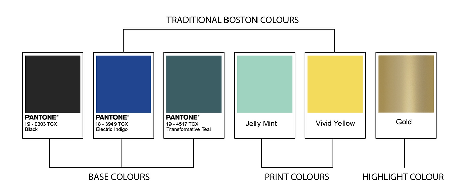
The finalised graphic features the Adidas logo seamlessly merging with Boston-inspired elements. The logo and accompanying text are filled with a gold application, reflecting a prominent theme in the collection. To complement this, I used shades of mint green to fill the aerial map and highlighted the racecourse in yellow, adding a vibrant and dynamic touch to the design.

FINAL LOOK
The final collection embraces a darker color palette, aligning with the 2026 trend forecast, which predicts a preference for darker shades. This shift reflects consumer demand for cooling tones as a response to rising global temperatures. The collection maintains Boston’s signature colors by emphasizing dark blue as the dominant hue across garments, while bright yellow accents appear through the prints for a vibrant contrast. Drawing from Adidas’ history of reintroducing colors, teal—last seen prominently in 2016—returns a decade later with a cleaner, more modern aesthetic, complemented by vivid, dynamic prints crafted for 2026.
The collection combines printwork and color blocking, creating a balanced yet striking design language. The logographic artwork is prominently placed on the back of the sweatshirt, while the track pants are kept clean and minimal to maintain visual simplicity. Key design details include the year 2026, integrated alongside Boston Athletic Association logos, a consistent tradition in event collections. For cost efficiency, the prints can be produced via sublimation, ensuring precision and quality.
Gold serves as the unifying element, applied to all logos and even fabric property print details. This metallic touch ties the collection together, elevating its premium appeal and reinforcing its cohesive identity.
